Monday, 5 May 2014

Gary Turk

'Everyone should watch this at least once.'


'This short video by Gary Turk is a reminder of the effects of social media on our society. By connecting online, we are disconnecting offline. What are we missing from life as a result? What critical moments do we miss that we didn't even know passed us by? Be sure to watch this entire video, especially the ending.' 
    
   - A powerful message written at the start of the webpage, just above the video.  'By connecting online, we are disconnecting offline' - no truer words have been written this day.  This shows that more and more people are realising the effect that social media has on our mind, body and soul.  Give the video a watch and see how you react, I know that I was completely overwhelmed and nearly shed a tear for all of those missed moments.


The video is entitled 'Look up', something which many people choose to ignore as they are glued to their smartphones 24/7.
Below are some quotes which I took from the video, each one hit deep inside my heart and made me feel quite angry at our modern stupidity;

- 'The media we call social, is anything but'.

- 'A world where we're slaves to the technology we mastered'.

- 'We all share our best bits but leave out the emotion'.
   - It is often difficult to express true feelings via social media, people only really see the best bits as it is easy to hide the hurt behind a computer screen.

- 'Talk to one another, learn to co-exist'.
  - I find this line extremely absurd, it's as if the creation of technology has pulled us apart and taught us to forget the natural instinct of co-existing.

- 'We're a generation of idiots; smart phones and dumb people'.
  
- 'When you're too busy looking down, you don't see this chances you miss'.
  - The question which people fear the most, 'What could've been?'

- We spend hours together without making eye contact.
  - I often find myself sitting with friends or family and realising that I have barely said two sentences or even looked at what they're wearing that day.

- 'Stop watching this video, live life the real way'.
  - This is the key line of the whole video.  The constant rhyme throughout makes it become addictive and almost impossible to stop watching until the end.  I also find it interesting how Turk assumes that his message has fulfilled it's intention and promotes the fact that people shouldn't watch his video anymore, once you've had the 'epiphany'.  Personally, I feel the hard hitting truths of the video would find a place in any social media users' heart.  

This video has helped to change the way I view the use of Social Media and encouraged me to enjoy life offline.

Victoria Siemer

Human Error by Victoria Siemer

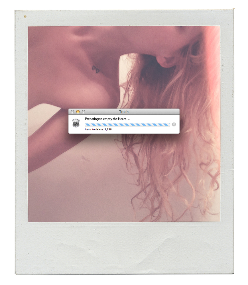
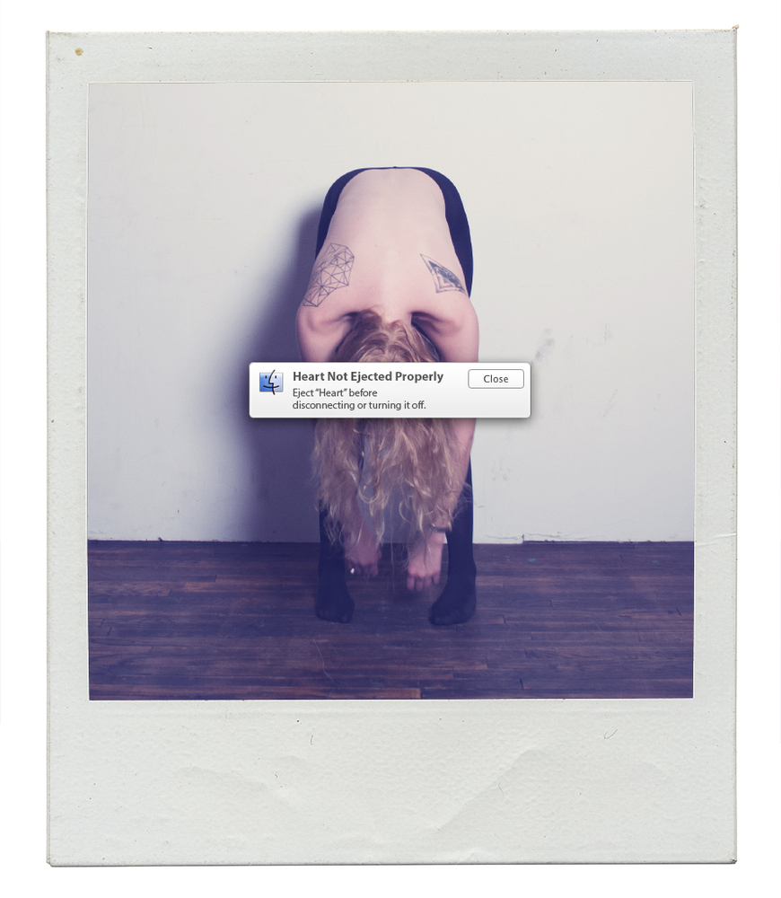
This magnificent series has been created to show the connection between 'the futility of dwelling on a broken heart with the uselessness of channeling frustration towards your tech devices.'  

My initial feelings toward this are of amazement and jealousy, 'Why didn't I think of that?!'.  The concept behind it receives 5 gold stars from me.  The girl in the image below looks almost as if her heart has been ripped out and that she can't straight, like it has been ejected from her body.  There is an unusual contrast between the humanity of a polaroid photo and an inhuman warning send by your computer when something is wrong.  However, it has also led me to consider if Victoria has questioned the humanity of laptops and smartphones, as if they have feelings too?

The series of photographs are full of rawness and emotion as they reflect wonderfully the different stages of emotion which the human heart goes through.  The images are able to convey pain and emptiness alone, but excel when loading bars are added as if the heart can be digitally emptied all at once, like the trash bin on your laptop.  However, I feel that there has been a certain amount of irony within this piece as the human heart never forgets and can never be emptied by the push of a button - and it is important that we all remember that.  I also question whether this indirect jab at the state of our relationships in the 21st Century, and how easy it is to fall out of love with someone, just by un-friending them on Facebook.  When did love become some digital?


Tuesday, 1 April 2014

Fredy Decisive


"CONFESSIONS IS A PUBLIC ART PROJECT THAT INVITES PEOPLE TO ANONYMOUSLY SHARE THEIR CONFESSIONS AND SEE THE CONFESSIONS OF THE PEOPLE AROUND THEM IN THE HEART OF THE LAS VEGAS STRIP."


First reaction to the installation: This is brilliant!
This is the kind of art which reminds me why I want to study an art degree for the next three years.  It gets people involved in the most personal way possible, by sharing their secrets.  Some of the confessions are humorous such as 'I eat too much cheese', but others are simply heartbreaking, 'I still love her.  2 girlfriends and 5 years later...' - I feel that many people can relate to these.  As people are allowed to post their confessions anonymously on the pegged wall, you may find that they have been a lot more honest than they would have been if they had to sign their name to it - like you would have to on social media.  I think it is interesting that people are will to confess anything as people can still leaf through the wall and read everything that has been posted.

 I like how the confessions are all written onto pieces of wood, that way the confessions cannot be erased or edited as easily as they would be online.  This makes them a physical problem, now part of the real world and not just a thought in our minds.   Something has to be said for the colour though.  Is it stereotypically red to symbol sin? I feel the overall appearance is somewhat church-like, especially with the addition of the confession booths.  A spanish quote is given at the top of the website I pulled these images from;

"Dicen que se la escapa la incoherencia de las manos, que se le caen los sueƱos cuando pasa. Que espera decidir pronto, entre quien es, y quien pretende ser." - I think the first bit means something along the lines that you can escape the inability (incoherence) of your hands in your dreams. In other words it's easier to draw/paint in ur dreams than in real life.  The second half seems to be criticising and saying that you must decide who you are and who you want to be , and do it quickly.  I think it has some truth in it as people often find it easier to write down their hope, dreams and deepest desire than vocally put them out there for people to judge and scrutinise.  


Charlie Billingham


I have recently become interested in using True Grain.  Charlie Billingham is creating pieces using True Grain as he wants to stay true to his painting technique and not producing anything which has been digitally altered.  I love the effect True Grain produces as it gives feeling to the work, a sort of rough texture which the viewer can appreciate.  You don't use True Grain by mistake as when you paint or print with it, the work achieves a sort of grainy, almost scratched look which would always be intentional.  I think it works particularly well with Charlie's piece as it emphasises the real effort and strain put in behind the dancers he is painting.  You can feel the emotion pouring from the image.


Ingo Maurer Zettel

'German born artist and light objects designer, ingo maurer has been the recipient of many design awards and his work has been featured in numerous exhibitions, including the museum of modern art in new york. considered an outsider with rare artistic style, ingo maurer adds provocation and fun to the world of design'


This breathtaking, independently suspended chandelier was created by Ingo Maurer.  It is a mixture of art and sculpture.  Ingo adds some love letters in different languages in order to inspire the owner to participate.  He uses Japanese paper to for a translucent medium so that there will be different lighting effects created depending what piece of paper the light hits.  49 blank pages are left for the owner to style the light as they desire, making it personal to them.  What would you write on your lamp?  Recipes, love letters, confessions, memories, shopping lists; the possibilities are endless.  

The letters are easily attached using thins wires and clips so as not to take away from the delicate nature of the lighting fixture.  I believe the wires are arranged in such a fashion so as to give the impression of a chandelier.  It is  definitely an alternative version but I think it looks beautiful.  The main aim of this piece is getting the viewer involved in art and poetry, and I think it works. 


Admit One stub box


I came across this image on Pinterest and unfortunately I have been unable to find the name of the designer.  I can see from close observation that the papers inside the box are all tickets from events such as concerts, football matches and cinema viewings.  There may also be a few wristbands in there from nightclubs.  I suppose this box could represent what you have taken part in during the last year or so in terms of socialising events.  It could also act as a kind of memory box, even though you can't see all the places you've been, you know the ticket are in the box somewhere, sort of like how you brain hold memories.  

I can imagine this piece on a wall in public places (shopping centre, restaurant, sidewalk) that way it would become a city memory box.  It could be great for tourism by showing how many events they have to offer, however the same stub could end up in there twice.  I could also see this piece mounted on your bedroom wall.  Instead of a picture wall or a shoebox under your bed, this could be on display to see whenever you want as a physical reminder; it's not an ugly looking box either!  I think I can assume that this piece was created in order to get people more involved in doing things, because when you don't participate you can't fill the box with anything.

Wednesday, 26 March 2014

Rikke Elverdam


I think this piece is absolutely fantastic.  It's filled with humour, familiarity and fresh deliciousness, as you can almost smell the fresh doughy bread.  The set up of this 3D type is very clever.  The background of an armchair is easily recognisable as an old person chair or living room, minus the standard hideous carpet and wallpaper.  'They call me grandma' - This has been made from baked bread with the grandma part slightly overdone, and I'm not sure if that was accidental or planned; but it works!  I feel like I can relate easily to this piece as when you think of grandparents, the thought of food swiftly follows.  Speaking from experience, every time I visit my grandma she tries to stuff me full of toast, oranges and toffee sweets.  It's just something that Grandparents seem to do as they fear you'll be wasting away otherwise.  Bread also symbolises warmth, comfort and familiarity.  In all, this piece works wonderfully as a 3D typography installation and a real life grandparent is not needed to communicate the brilliance behind the idea. 


Danielle Evans


I absolutely love these pieces create by Danielle Evans.  She create 3D typography using foods which represent the words she is producing.  'This is my Jam' was created out real raspberry jam and sprinkles as part of a project by the name of Food Type.  This piece almost reminds me of something I would do as child, messing around with the jam on a saturday afternoon waiting for my cupcakes to cool so that I can decorate them.  I feel like her project is to evoke memories and good feelings when viewed.  Does it make me feel happy?  Yes, it brings back many fond childhood memories and also makes me slightly hungry.  Her aim is to create as many words as possible using food products.   - http://foodtypography.com 


I especially love this piece as I can only imagine how time consuming it must have been.  It is remarkable how she managed to push each crumble of the cookie in an exact location in order to create a crisp and easily readable quote.  I like how she included the half eaten biscuit at the bottom of the image as if to make it obvious what the words were made from - otherwise it may have been hard to know it was biscuits that she used, thus destroying the point.  It may have created an interesting contrast if she had used different types of biscuits, for example digestives and bourbons as the two contrast greatly in colour.

Lucy Norris - Dreamscape Typography


Lucy Norris is currently studying Graphic Design at University and I recently came across her design blog.  She was set a new project where she had to create a new typeface made completely from wire.

'I had to pick a quotation use my new typeface and present it in a visual way. My typeface is called Dreamscape. I chose to twist the wire to create a fantasy effect.'  

"Imagination is more important than knowledge".  I can see why Lucy chose to wind the wire round several times to create loops as it makes the typography look a lot dreamier and magical.  It reminds me of something that you would see at the start of a fairytale story, almost grand in a way.  The tiny loops also remind me of little flies or bumblebees, maybe connecting the idea back to nature?  Even though that may seem ironic as metal is considered quite industrial; the opposite of natural.  

The typeface is successful in communicating her 'Dreamscape' idea, as it is called, however I do find it slightly difficult to read as she put so many loops in there.  The darkness of the wire also makes it seem quite eerie in a sense, so there could be improvement when considering the colour.  As a 3 dimensional typeface, it works wonderfully as it able to stand alone and you get the lovely shadowy effect when light is shone sideways on it.  In all, the typeface has been beautifully constructed and suits the quote perfectly.  It seems as though she might also be questioning if your imagination is suppressed and bound up as such by the tight wire so of society.  Does society appreciate the wealth of knowledge more than the wealth of imagination?


Sunday, 23 March 2014

Leeds Love Wall

\

This was a strange yet inspiring installation set up in a local shopping centre.  The designer of this wall remains anonymous but we can only assume it was set up by the managers of 'The Light' in Leeds.  

The wall was set up during the week prior to valentines day, in the middle of the centre.  Beside the wall were a pile of red papers hearts, some sharpies and blu tac.  The objective was to write a message to your loved and be entered in a competition to win a romantic getaway for two.  It was strange who the wall attracted; young, old, manly men, children and one woman even found her marriage proposal attached to it! 

I find this idea quite enchanting as hand writing a love letter is a very personal and intimate action, even though it would be posted on a public wall.  Isn't that what we do on Facebook anyway?  Nonetheless it was an opportunity for people to express their love even if the person it was meant for would never see it, it was out there for the world to see.  I enjoy this type of art as it allows the audience to physically engage and become involved in the Artist's vision.


The Handwritten Letter Project


'DEAR READER.
The HAND.WRITTEN.LETTER.PROJECT was after a conversation about how personal a letter can be:
a fact that is currently drowning in a tide of depersonalisation, with junk mail and automated correspondence.
There is always something nice about receiving a letter, especially these days when email, text, status updates, and tweets, dominate our communication, leaving many to lose sight of the things that have been around for a while (like
ink and paper). However, it is important that they do not.'

This is probably one of the most inspiring artists I have discovered.  Leading influences and designers around the world have written to Craig in order to have their voice published in a book.  Is this form of communication feasible?  I can only imagine how many letters Craig would've had to open and how many paper cuts he acquired along the way.  Surely some of the letters must have a been misplaced, or got lost in the mail; Something which wouldn't happen if send via digital email.

The books itself is very inspiring as it visually shows how art and design has been evolving in this modern world.  Also it includes many ideas of individuals aspiring to make the world an even better and brighter place.  Since some of the responses were received in 2007, it is interesting to see if dreams have become reality and if not, why not?  Our culture and the way we live is continuously evolving, even as I am typing this.  

Why did he turn the letter he received into a book and not an online blog?  I suppose that would probably defeat the purpose of the project, but it would be interesting to see the responses nonetheless.  In all I think the project is a success as looking through it there are a lot of very interesting ideas accompanied with some of the best handwriting I have ever seen.  You can tell a lot about a person from the way they dot the 'i's and cross the 't's.


'Let's make a dent in the Universe' - How inspiring! but can you dent it enough to cause change?

The Happy Mail Project

The Happy Mail Project is a run by blogger Merissa Cherie.  People who follow the blog can send in hand written letter using paper and envelopes which they have hand made and personally designed.  When Merissa receives the letter, she returns a reply on paper which she has created or picked from a paper shop.


I especially like the one she has picked to send back to Anna Fatovich in Greece.  I think you can tell so much about the nature of a letter according to its packaging and typeface used to state the address. Anna seems like young girl who possibly loves the colour orange and find solace in butterflies.  

I think the idea behind this 'mailing service' as such, is wonderful.  It almost works like a pen pal service, one of the most personal forms of communication to someone who you probably have never met.  Each card is a unique design, never to be replicated and meant for one person only.  I think there is something beautiful in that.  Are hand written letters still considered as an important form of communication?  I think so.  There's no better feeling than ripping open a letter to find what lies inside.


Saturday, 22 March 2014

Before I Die..

This 'Before I Die Wall' was created by Candy Chang after she lost someone close to her.  The aim was to help her deal with the extreme grief she was experiencing.


'Anyone walking by could pick up a piece of chalk, reflect on their lives, and share their personal aspirations in public space.  It was all an experiment and she didn’t know what to expect. By the next day, the wall was completely filled out and it kept growing: Before I die I want to… sing for millions, plant a tree, hold her one more time, straddle the International Date Line, see my daughter graduate, eat more everything, abandon all insecurities, be completely myself… '
The concept behind this 'wall' is very inspirational.   It brings communities together and allows them to physically engage with each other.  It is quite like social media where you post things on a wall for people to see, however I feel that this one is a lot more personal.  'Before I die' is quite an intimate question to ask yourself.  Are you living life to the fullest? or have you given up on your dreams.  It restores perspective, something which is so easily lost in this modern world.
'Over 450 Before I Die walls have been created in 30 languages and over 65 countries, including Kazakhstan, Portugal, Japan, Denmark, Iraq, Argentina, and South Africa.' - This statement is truly inspirational and gives me hope that people are still kind, sharing and most of all human.  


From a design perspective, the wall is a great interactive piece which can be reused and altered as many times as the creator would like.  The chalk markers are easily removed using water, meaning that anything which doesn't not bring joy or positivity to the wall can be taken down almost immediately.  There is a very positive aspect to this installation as it allows people to share their lives, hopes and dreams with each other, letting their personalities roam free with no restriction. 

Wednesday, 19 March 2014

Durex Earth Hour


Durex campaign promoting Earth Hour.

I feel that this campaign is very thought provoking as the interruption of technology is becoming an increasingly terrible problem for our generation.  It has been proven that 6% of the population would check social media sites even during sex.  What does this say about our human relationships and current social interactions with each other?  Sexual relations are very personal and intimate, but figures like this prove that they will become alien in no time.  Does the art of real conversation/intimacy still exist?  It is hard to know with so many online dating sites being promoted through social media, people have more reason than ever to be glued to it.  I feel that Durex are the right company to promote such a hard hitting problem that we all face.

By using sites such as YouTube to promote the campaign, Durex is able to target all ages and gain widespread awareness.  They have cleverly included a generational key by hash-tagging the campaign at the end of the video, making it easy to find online.  If you hashtag something online, it is sure to spread like wildfire within 2 hours of being uploaded.  #TurnOffToTurnOn, the use of an oxymoron at it's best.  With this slogan, I think that more people than ever will be joining in on Earth Hour.  I know I will be.  Will you?


Barbara Kua


Barbara Kua Calligraphy is a Toronto fine lettering studio.  They do many event pieces such a wedding invitations and business cards.  I chose this piece as the style of calligraphy writing matched with the red ink seems very elegant and suited for romance.  The intimacy would have been lost in this invitation if the red lettering had been digital printed.  I always find a certain innocence and delicacy in hand written wedding invitations.  Love is one of the most human emotions a person can feel, so why should an invite to celebrate this union come from a digital source?  The calligraphy in itself is delicate with much attention to detail.  I like the smooth variation in the thickness of lines as it gives the invitation a refined and elegant feel, like the letterer really did pay attention to detail.  I find that with mass produced invitations, they often lack effort and/or personality. Just by looking at the invite you can get a good idea about the love that these two people share.

Saturday, 15 March 2014

Garbage Beauty

Vincent Box and Romain Boz are co-founders of the street art group, 'Garbage Beauty'.

“Living in a big city, walking through the streets, we’re surrounded by advertisements, posters, shop signs, but we’re so used to seeing it that it doesn’t call out to us,” says Box. “But when you see something on garbage, it’ll capture the attention of 95 per cent of people because that’s like a final frontier, the last place you would expect to see something written.” 

It is true in what they day that people do not often notice something which is normal, they are more likely to notice something which is 'abnormal' or stands out.  Below is one of my favourite pieces of their collection.  The comment that 'you look good when you smile' could relate to anyone as they look into the mirror and see themselves.  However, since it's written in calligraphy, it seems a lot more personal than impersonal.  It is also quite a good way of making people smile subconsciously, indirectly spreading joy to people through art.  That is the kind of design which inspires me to inspire the world. 


“There’s a human element to our work. It’s like calligraphy — it’s not perfect, like type on a computer screen,” he reveals. “There are sometimes spelling errors that we’ll make, or the joke isn’t that great, or it doesn’t really fit on the object, but that reflects life. It’s human.” 

I was attracted to this Street art group as they make use of materials which are essentially rubbish and turn them into something of interest and beauty.  They believe that something being imperfect is more beautiful than something unnaturally perfect.  The problem with many adverts or posters either online or in the street is that they have next to nothing when it comes to personality.  For example, when someone writes something on Facebook, the typeface used is exactly the same as everyone else's.  No mistakes and over curled 'C's as all mistakes can be edited or removed.  There is a sense of security in all the post looking the same, however I prefer street art as it is daring and beautifully different.  This kind of free hand work reflects our 'human' nature as everyone's hand writing is interesting and different.  No two pieces of work produced by Garbage Beauty are the same as all their work is painted first hand, not printed.  Although this may be time consuming, the overall outcome is far better than if each quote were to be digitally reproduced on stickers.  

Sunday, 9 March 2014

Me & My Pen

Me&MyPen is Daren Newman.

A typographer, illustrator & designer.

'Bio: Male, smaller than average, good/bad SOH, beard wearing,
right-handed, Rotring loving Mancunian.' 


What I love about this typeface is how it has been elegantly joined together by the first and last letters of each word.  I have deep respect for handwritten typography as it is very technical and time consuming.  The typeface itself its quite bold yet I feel the elegantly placed curls of the letters make it endearing and personal.  This would work in any colour against a white background, although black and white sticks particularly well with the handwritten feel to this piece.  

I could image this on a card, or beauty product or even on the cover of a book.  The strong, clear lettering means that this typeface could be very versatile and used for many purposes.  Darren works in a clear, linear style which reflects in many of his typographical designs.  Personally I feel that three dimensional type can sometimes be a bit of an effort to read/decode so for something as simple as 'All about you', the linear style works wonderfully.  This kind of design is completely different than something you would find on a webpage or a social media website.  It may be considered as 'too fussy' and not clean cut enough for be easily accessible.  I have realised that within my own research, online media sites tend to keep their typeface simple and clear so as people can look at it for a long time without much effort or strain.  I have noticed that the contrasts between hand drawn and digital typeface are enormous.  Therefore, the personal feel to this work has inspired me to create my own experiments and include hand drawn designs like this in my final project.


Yani Arebena and Guille Vizzari


Yani Arebena and Guille Vizzari are a team of Argentinian type designers who do lovely treatments of their typefaces.


I love this typographical design because I have recently become interested in calligraphy.  I think this typeface works well with subject of marriage as calligraphy is one of the most romantic typefaces there is.  

The pastel colours of pink and blue symbolise the joining of of marriage and also the shared relationship of a man and woman.  The white of 'the' and '27/04/2013" works well as contrasting figure between the two main words 'save' and 'date'.  However, the background is strange as not many wedding invites would have a dark background, although is does work well as a contrasting element.  I think that a cream background would have worked well if they changed the colour of the white lettering to a darker colour.  The calligraphy used here is very simple, pretty and delicate, like a wedding should be.  In all, I feel the whole design is beautiful and it would encourage me to 'save the date' and be a part of whatever occasion I had been invited to.


Jessica Hische


Jessica Hische;

"Bing put together a really fun campaign this year that I was pumped to be a part of—each day they had a letterer create a search term, something you would do in the summer. For a week, my lettering was posted one day at a time, but it was really fun to see what some of the other letterers did for the project!"

I enjoy how Jessica is able to transform and image by layering different typefaces across the front of them.  For instance, this picture of a coffee cup could mean anything; a coffee date, 9am coffee before work or coffee on a sunday.  She has transformed this image into a dreamy haze as the image is left slightly out of focus with the romantic typeface becoming centre stage.  The typeface itself seems very solid but with a romantic flick here and there.  The thing that really sets it off are the swirls and lines all around the writing, I feel give the impression of relaxation and love.  I like that she has used white for the writing against the slightly darker background to give that fresh, crisp morning feeling, even if breakfast in bed is about being lazy.


This image is interesting as the typeface selected reminds me of the 60's and summer time.  The flowing nature of the type is reminiscent of waves and the seaside, like I can almost taste the salt in the air and feel the sun on my skin.  Again, Jessica has used white for the writing as it reflects freshness and freedom, the most important aspect of a road trip.  People who go 'road tripping' are more than likely young adults so I would say that white is an attractive colour to them as it also symbolises youth.  Other than that, the white contrast really well with the red and brown bags and also the clear blue sky.  The image combined with the type makes me want to take a trip to the beach and eat ice cream.  It is very idyllic.  I think Jessica has been successful in creating that holiday feel for her brief and the images she creates are very persuasive. 


Thursday, 6 March 2014

Federico Pietrella


Federico Pietrella created these images by using date stamps against a white wall.  I find it very interesting that he was able to create tone in the image by making the stamp less dense in the lighter areas.  As a result the image looks quite pixilated which is strange as it is ultimately hand made, not of digital origin.  The black/grey/dull tone of this image works well the male character featured.  His face looks quite pensive, almost forlorn - would this differ if Pietrella had used red, blue, yellow ink?


I find the image intriguing as the male character is anonymous and there is no caption for this work explaining what it means.  Is it date '26th APR 2012' when the work was created or does it have a special meaning to the artist?  I feel this gives it a personal touch but also causes a sense of mystery for the audience.  The piece is without a doubt beautifully constructed and it has inspired me to create my own anonymous face out of hand crafted stamps.  I like the fact that if Pietrella were to try and recreate this work, it would never ever be identical as the placing of the stamps are set in time and cannot be exactly replicated.  I would think that the creation of this piece could be quite time consuming and require immense patience, yet it is executed beautifully.